
A control chart compares time-ordered process observations with limits derived from a suitable baseline. It helps identify variation that deserves investigation rather than adjustment after every up or down movement. Choose the chart for the measurement and sampling method, keep specifications separate, and agree the signal rules in advance. An out-of-control signal identifies unusual behaviour under the model; it does not identify the cause or authorize an automatic machine adjustment.
Choose a chart for measurements or nonconforming units.
Calculate and interpret a small p-chart example.
Create a response rule that avoids chasing noise.
Name the decision before choosing the chart
Suppose a reject percentage rises from 3% to 5%. That might reflect normal variation, a different sample size, a changed inspection rule or a process disturbance. A chart gives those observations a defined comparison, provided the data model fits.
NIST distinguishes charts for measured variables and attributes. I-MR charts can suit individual continuous measurements; X-bar and R or S charts use rational subgroups. A p-chart tracks the fraction of units classed as nonconforming. Defects per unit are a different measure.
This is a signal-and-response guide, not a replacement for root-cause analysis or a capability study.
Keep limits separate from the drawing
A specification says what is acceptable for the part. Control limits estimate the behaviour expected from the process and sampling model. A stable process can still make unacceptable parts; an unstable process may temporarily produce parts within specification.
Choose observations from comparable conditions. Mixing products with different acceptance rules or combining consecutive values that are strongly correlated can make familiar limits misleading. More sensors do not solve this sampling problem.
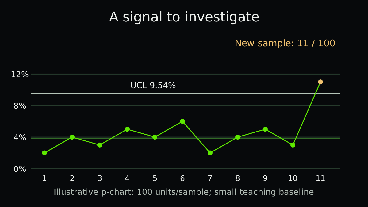
A p-chart with a visible investigation signal
Illustrative example: ten baseline samples each inspect 100 units. Nonconforming counts are 2, 4, 3, 5, 4, 6, 2, 4, 5 and 3. Their total is 38, so the weighted baseline proportion is 38 / 1,000 = 0.038.
For the conventional three-sigma p-chart, the upper limit is 0.038 + 3 × sqrt(0.038 × 0.962 / 100), approximately 0.0954. The computed lower limit is negative and is clipped to zero. A new sample with 11 nonconforming units out of 100 has p = 0.11, above that upper limit.
Ten samples make the arithmetic easy to inspect; they are not evidence of an adequate production baseline. Also, only 3.8 rejects are expected per sample here, so the usual symmetric limits are an approximation with uneven tail probabilities. For low counts, review binomial probability limits or another suitable monitoring method with a qualified analyst. Establish sufficient representative baseline data and review model assumptions before operational use.
p̄ = total nonconforming units / total inspected units. Bound limits to 0 and 1. For unequal sample sizes, use each sample’s n.
| Quantity | Illustrative value | Meaning |
|---|---|---|
| Baseline | 3.80% | 38 / 1,000 |
| Upper limit, n = 100 | 9.54% | Rounded model limit |
| New observation | 11.00% | 11 / 100; investigate |
Write the response beside the chart
A chart without a response owner is just another dashboard. Decide who checks the record, who contains potentially affected product and who can authorize a process change.
Containment for a serious quality risk follows the approved quality procedure even when no statistical rule has triggered. Statistical monitoring does not overrule product safety or customer requirements.
- Select the right population
Record the product, characteristic, inspection method and sampling interval.
- Establish and review the baseline
Retain time-ordered observations, known events and a justified chart model. Do not erase inconvenient points without documented cause.
- Agree rules before monitoring
Specify the limit and any additional run rules, their rationale and the response owner. Adding many rules increases false-alarm opportunities.
- Respond and document
Verify the observation, contain according to procedure, investigate and record any approved change.
Avoid automatic recentring after every signal
Recalculating limits each morning can absorb a deteriorating process into a new normal. Keep a controlled baseline until there is an explained change and sufficient evidence for new limits.
The opposite mistake is adjusting a stable process after every noisy observation. That can add variation. Use the agreed signal rules and operating procedures rather than interpreting each point in isolation.
Make digital alerts carry the sampling context
An alert should include the observed count or measurement, sample size, timestamp, baseline version and rule triggered. A red icon without those fields is hard to investigate.
Track false or unhelpful alerts as well as confirmed disturbances. Manufacturing quality analytics should preserve that context, including missing inspections and changed acceptance definitions.
Practical checklist
- Define the characteristic and population.
- Choose a chart that fits the data type.
- Retain sample size and observation time.
- Check independence or justify another model.
- Keep specifications separate from control limits.
- Document baseline and rule versions.
- Assign containment and investigation responsibilities.
- Review limits only after an explained process change.
FAQ
FAQ
Sources and further reading
Authoritative references used to research and verify this guide.